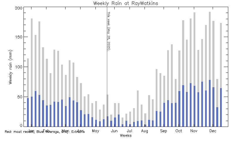
Weekly Rain at Ray Watkins Elementary
What does this figure show?
It's difficult, using our network of weather stations, to say what normal precipitation is at a particular site. This is because we simply don't have enough data yet. In general we haven't observed enough rainy days to compute meaningful statistics. Furthermore, it is difficult to show daily precipitation for the entire year at once. The extreme winter (wet season) rain far exceeds the dry season values and 365 is a lot of vertical bars. So, we've binned daily rain into weekly sums and computed the mean and maximum of these sums. This figure shows the weekly total rain amounts that we have observed at each site.
The grey histogram shows the extreme weekly amounts. The blue histogram shows the mean weekly amounts and the red histogram gives the weekly values from the past year. In other words, the grey and blue bars characterize all available observations over weekly periods and the red bars are weekly observations from the last twelve months. The months are labelled on the x-axis to help you align the weeks throughout the year. The label positions are approximate.
From the figure we hope to be able to see if a particular week, especially the most recent one is different from normal (the mean) or even extreme.


